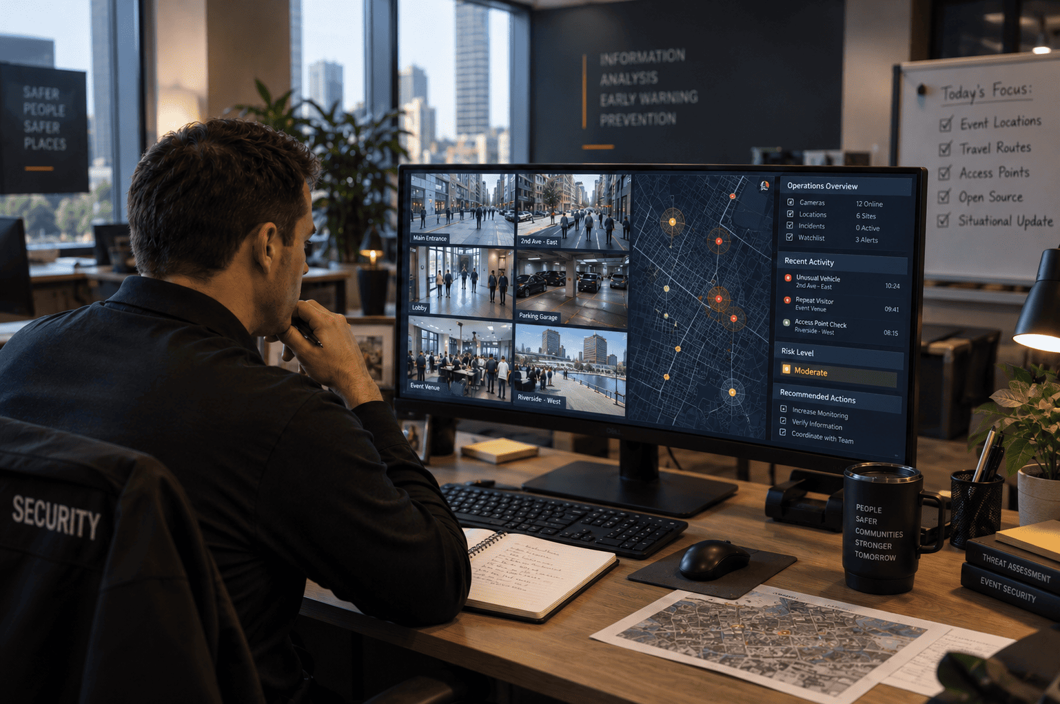
Purpose: This brief gives a designer, photographer, or image-sourcing partner clear, unambiguous direction for the visuals accompanying this blog post — so the imagery reinforces Delta’s authority, feels genuinely real (not AI-generated or generic stock), and supports the SEO and AI-visibility goals of the publishing program.
1. Core Design Principles
- Authority through restraint. Protective intelligence is a discreet, analytical discipline — the imagery should feel calm, precise, and credible, never like a spy thriller or surveillance-state visual.
- Real over synthetic. Images must read as authentic photography, not AI-generated or overly retouched stock. See Section 2 for specifics.
- Signal over drama. This blog’s core idea is that small, ordinary-looking signals add up to risk. Compositions should favor ordinary, everyday settings (a desk, a phone, an office) over dramatized ‘threat’ imagery — the mundane setting is the point.
- Brand consistency. Match the navy (#1B2A4A) and deep maroon/red (#8A1F2B) accent palette already used across deltastrategicsolutions.com and the Cyber-Physical Risk blog, so every post visually belongs to the same publication.
2. How to Avoid an “AI-Generated” Look
AI-image tells are increasingly recognizable to both readers and search engines, and they undercut authority rather than build it. Direct photographers/designers or stock curators to actively check for and reject images with:
- Unnaturally smooth or waxy skin texture, or asymmetric/malformed hands and fingers.
- Screen content (phone or monitor text) that looks garbled, warped, or nonsensical up close — a common AI tell, and a reason to keep real screens blurred or out of focus rather than fabricated.
- Lighting that doesn’t match across a single scene (e.g., a shadow direction that contradicts the light source).
- Overly perfect symmetry in faces, rooms, or reflections — real environments have clutter, wear, and asymmetry.
- A shallow, “rendered” look to depth of field, or backgrounds that feel like a generic gradient rather than a real space.
Preferred sourcing order: (1) Delta’s own photography from real facilities, case studies, or team photos; (2) commissioned photography with a real photographer; (3) premium editorial/documentary-style stock (e.g., Getty, Stocksy, Unsplash+) curated specifically to avoid the generic “corporate stock” look; (4) AI-generated images only as an absolute last resort, and only after manual retouching to remove obvious artifacts.
3. Image-by-Image Brief
Use this table to brief a photographer, designer, or stock curator section by section. Each row maps to a specific point in the blog.
Placement | What the Image Should Show | Style / Mood | Avoid |
1. Featured / Hero Image | A senior analyst at a desk with multiple monitors showing generic research/open-source material (maps, timelines, blurred documents — nothing resembling a real surveillance dashboard), shot from over the shoulder or a three-quarter angle so no screen content is legible. | Documentary/editorial style. Calm, focused, low-key lighting — desk lamp or window light rather than flat office fluorescents. Muted navy/charcoal palette with a warm accent light. Slight shallow depth of field for realism. | Neon ‘hacker’ aesthetics, glowing green code, magnifying glass over a face (spy-movie cliche), obvious dashboard mockups with fake red alert graphics. |
2. Intro / Scenario Section | A smartphone resting on a desk beside a laptop, screens angled away from camera or intentionally out of focus so no real message/content is readable — suggesting an unread notification rather than showing invented text. | Natural desk setting, soft window light, slightly cluttered (a notebook, a coffee cup) to read as real rather than staged. Cool, contemplative tone. | Fabricated on-screen text implying a real threatening message; overly dramatic lighting; a fearful facial expression aimed at camera. |
3. Patterns Section — Slow-Building Fixation | A hand scrolling a generic social media feed on a phone, screen blurred/out of focus, in a neutral setting (cafe table, office desk). | Candid, natural hand position, everyday lighting. | Any real (or real-looking) social media UI, legible usernames, or implied identifiable person. |
4. Patterns Section — Insider With a Grievance | An employee at a workstation in a shared office, shot from behind or a side angle so no face-driven narrative is implied about a real ‘suspect’. | Neutral, ordinary office environment — deliberately unremarkable, which reinforces the blog’s point that insider risk doesn’t look dramatic. | Anything that visually implies guilt (dark lighting on one person, isolating them from colleagues, exaggerated secrecy). |
5. Patterns Section — Public Appearance Risk | A wide shot of an empty or filling conference stage/auditorium before an event, or a lectern with a microphone, shot from the back of the room. | Clean, professional, slightly formal — the calm-before-the-event feeling. | Crowds with visible real faces; anything staged to look like a specific real company’s actual event. |
6. Delta Capability Section | A senior-looking security professional reviewing a printed report or tablet alongside a monitor, in a well-lit, orderly office — visually signaling competence and calm authority. Ideally sourced from Delta’s own team/case-study photography. | Warmer, more confident lighting than the intro section. Consistent navy/maroon brand accent (folder, lanyard, subtle uniform detail). | Generic stock-actor ‘model smiling at camera’ shots; anything staged for a stock library; overly tactical/military styling that doesn’t match Delta’s discreet, advisory tone. |
7. Closing / CTA Section | A calm, understated shot reinforcing ‘Protecting What Matters’ — an office building entrance, a handshake in a professional lobby, or a quiet exterior at dusk. | Calm, authoritative, restrained — confidence rather than alarm. | Anything that reads as intimidating, secretive, or surveillance-heavy — this section should reassure, not unsettle. |
4. SEO & Publishing Requirements for Images
These requirements make sure the images support — rather than slow down or dilute — the SEO and AI-visibility goals of the blog program.
Requirement | Specification |
File naming | Descriptive, hyphenated, keyword-relevant. Example: protective-intelligence-threat-analyst-desk.jpg — never IMG_1234.jpg or Screenshot.png. |
Alt text | Describe the image naturally and include the target phrase once where relevant. Example: “Security analyst reviewing protective intelligence research at a desk.” Never keyword-stuff. |
File format | WebP preferred (fallback JPEG). Avoid PNG for photographs — file size hurts page speed, which is a ranking factor. |
File size | Under 150KB per in-content image; hero image under 250KB. Compress before upload (TinyPNG, Squoosh, or CDN auto-optimization). |
Dimensions | Hero/featured image: 1200x628px (matches Open Graph / social share spec). In-content images: 800–1000px wide, consistent aspect ratio (4:3 or 16:9) throughout the post. |
Captions | Optional, but where used, they should add context (not repeat the alt text verbatim) and can reinforce topical relevance naturally — e.g., referencing ‘protective intelligence’ or ‘threat assessment’ where it fits the image. |
Schema / markup | Ensure the featured image is registered in the page’s Article schema (image property) so it’s eligible for rich results and AI-platform citation. |
Consistency across posts | Use the same color grade, brand accent (navy/maroon), and photography style as the Cyber-Physical Risk blog and every other post, so the Insights & Resources section reads as one authoritative, cohesive publication — not a stitched-together mix of stock libraries. |
5. Authority & AI-Platform Visibility Notes
- Real, high-quality imagery (versus generic or AI-generated visuals) is one of the signals that separates an authoritative industry publisher from a content-mill blog — both to human readers and to the systems (search and AI platforms) that decide which sources are worth citing.
- For a topic like protective intelligence, restraint matters as much as realism: imagery that looks invasive, surveillance-heavy, or thriller-styled undercuts the discreet, professional positioning the blog text establishes. Calm and ordinary reads as more credible than dramatic.
- Where possible, use imagery that could plausibly be Delta’s own operational environment (an analyst’s desk, a briefing room) rather than anonymous stock — this reinforces the “we are the ones who do this work” positioning the blog is making in writing.
- Keep a shared image style guide (color grade, aspect ratios, brand accent placement) consistent with the Cyber-Physical Risk blog’s design brief, so every Insights & Resources post reinforces the same visual identity — consistency compounds authority over time.
- Ensure every published image is referenced in the page’s structured data (Article schema) and included in the XML image sitemap so it is fully crawlable and citable.
Leave a comment